
Ooby’s Product Packaging
The Objective:
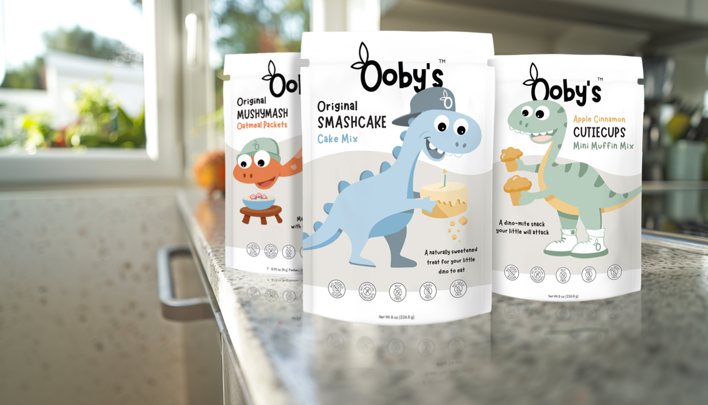
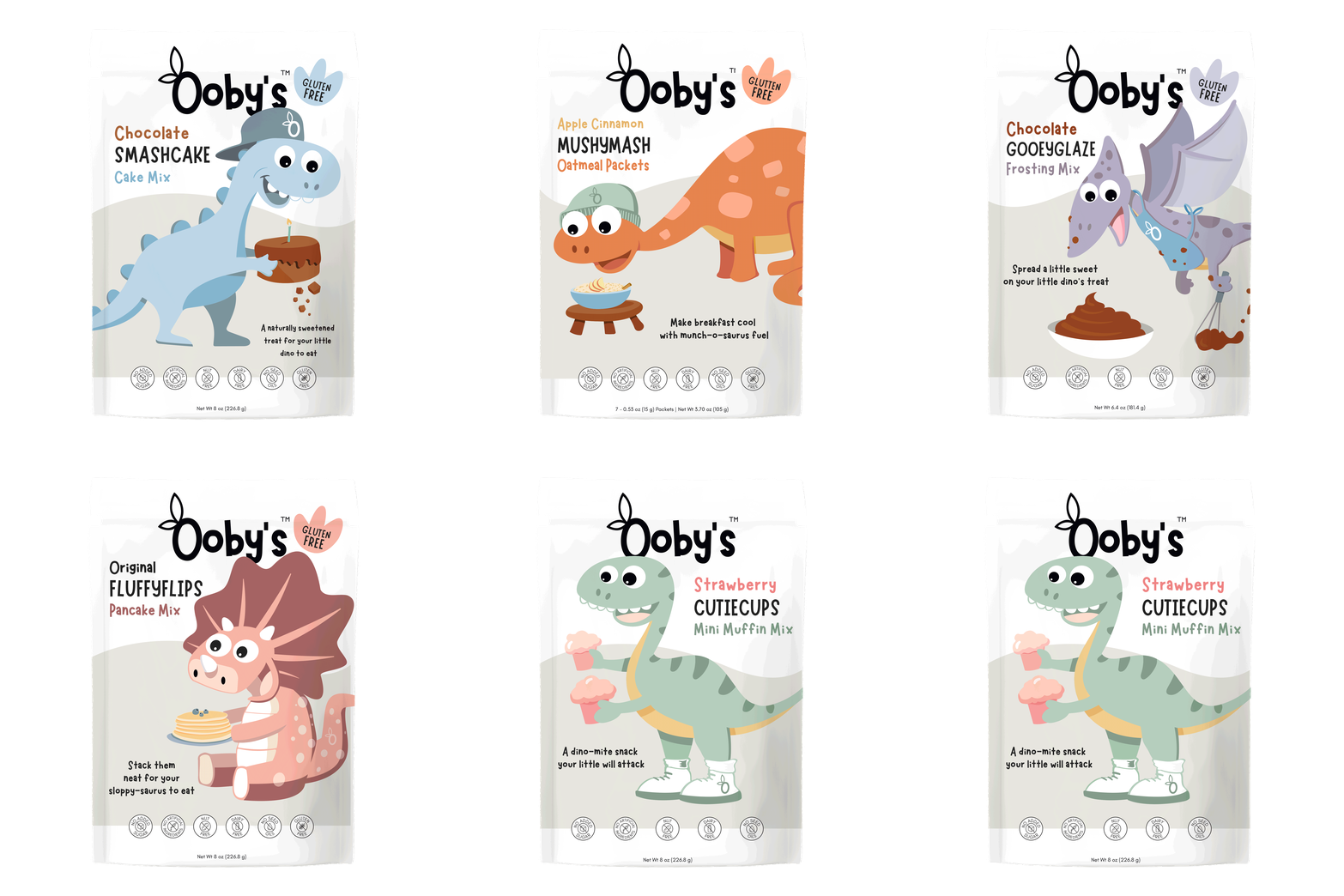
Ooby’s aimed to refresh their existing line of healthy, no-added-sugar cake mixes for children. The objective was to revitalize the packaging to better appeal to kids with fun, engaging visuals while reassuring parents of the product’s health benefits. The redesign needed to:
-
- Create a more vibrant and playful design to capture children’s attention.
- Communicate the product’s health benefits to parents.
- Enhance shelf presence to boost sales.
The CDC Solution:
Catral Doyle Creative Co. approached the packaging redesign with a strategy focused on creating a cohesive, engaging, modernized look that would appeal to children and parents.
-
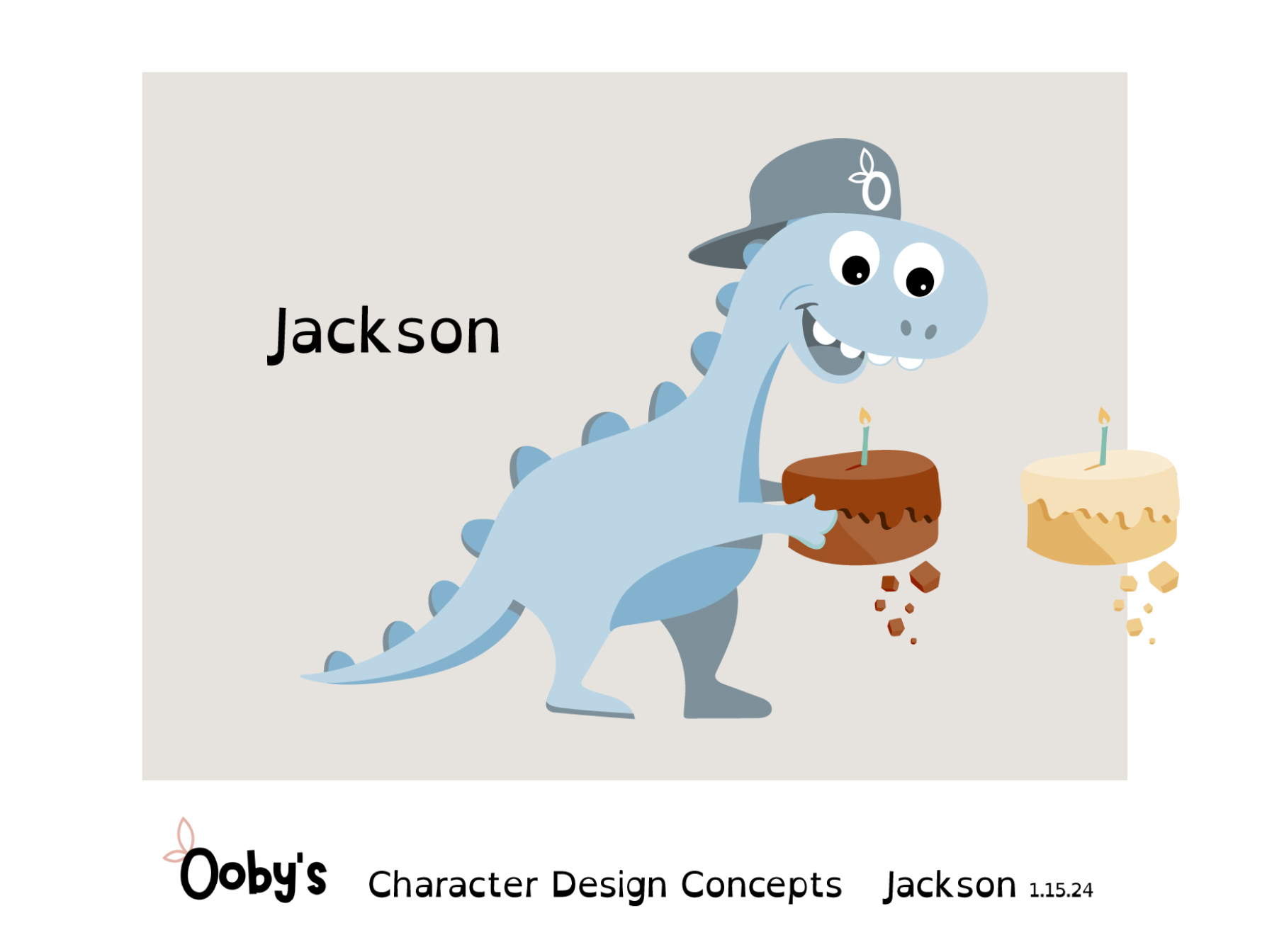
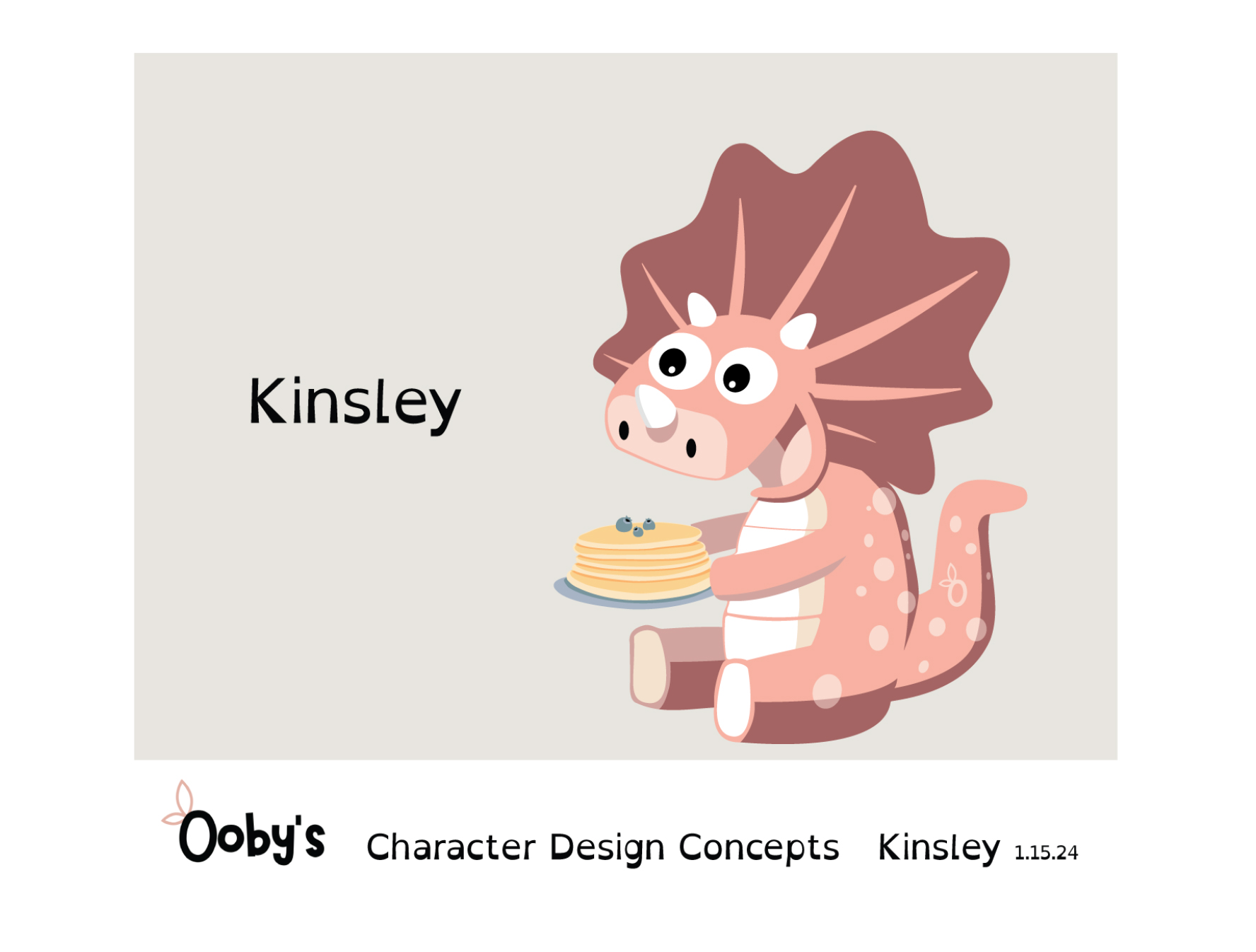
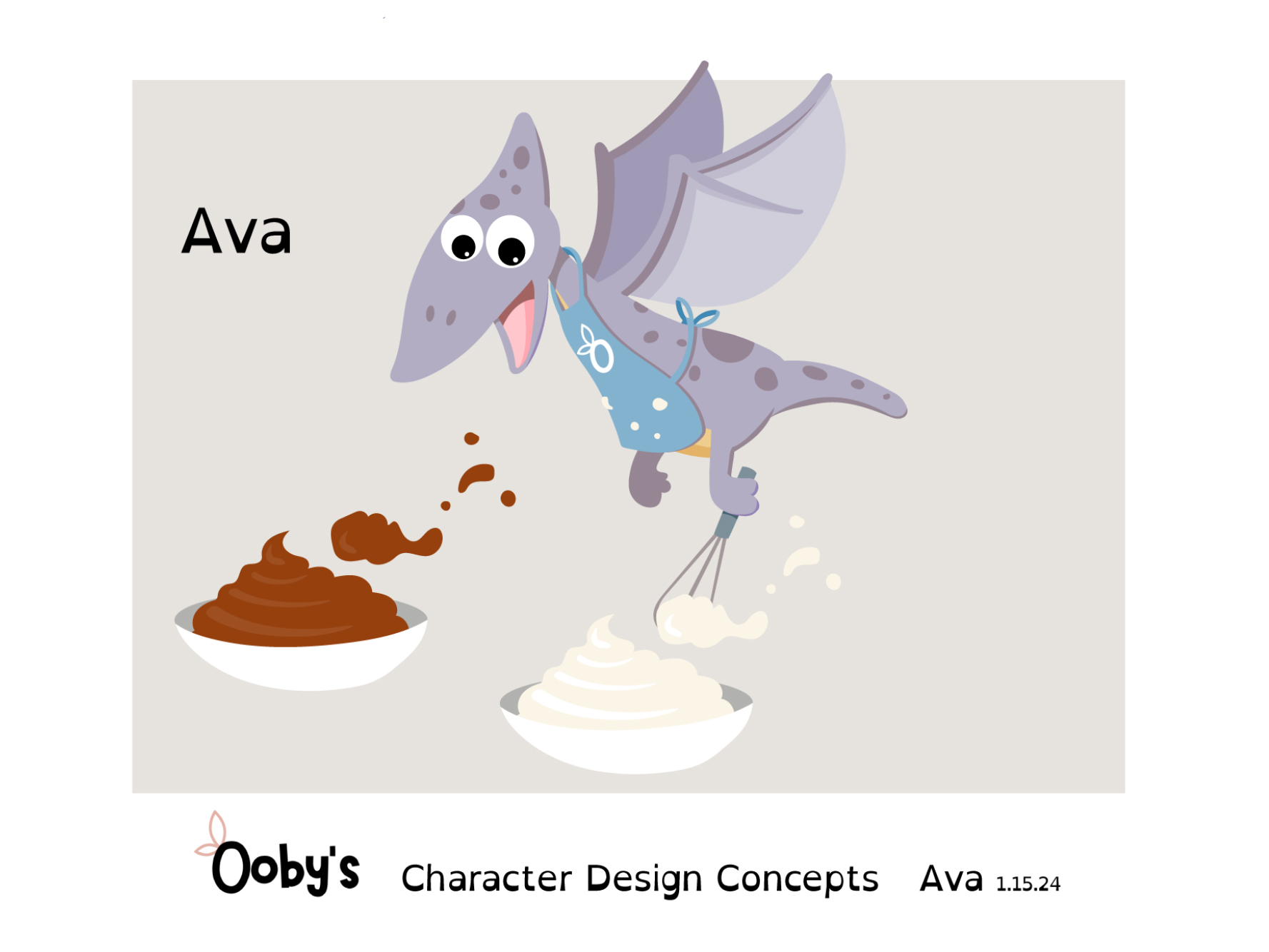
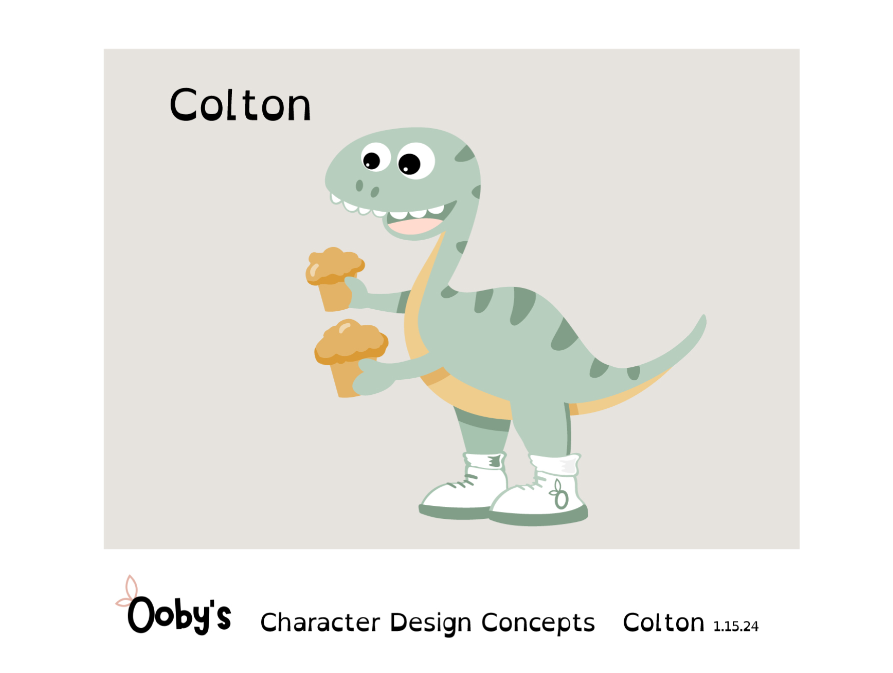
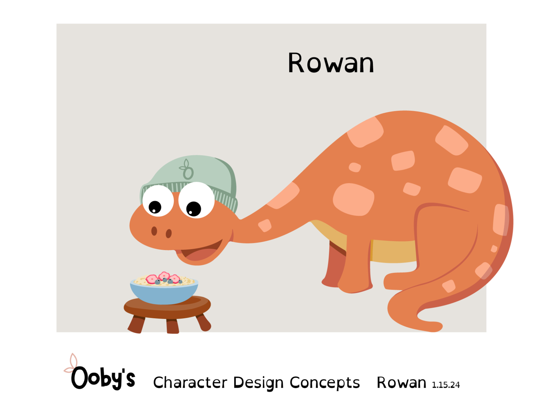
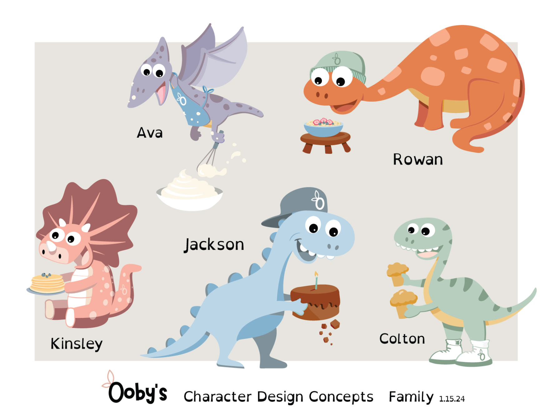
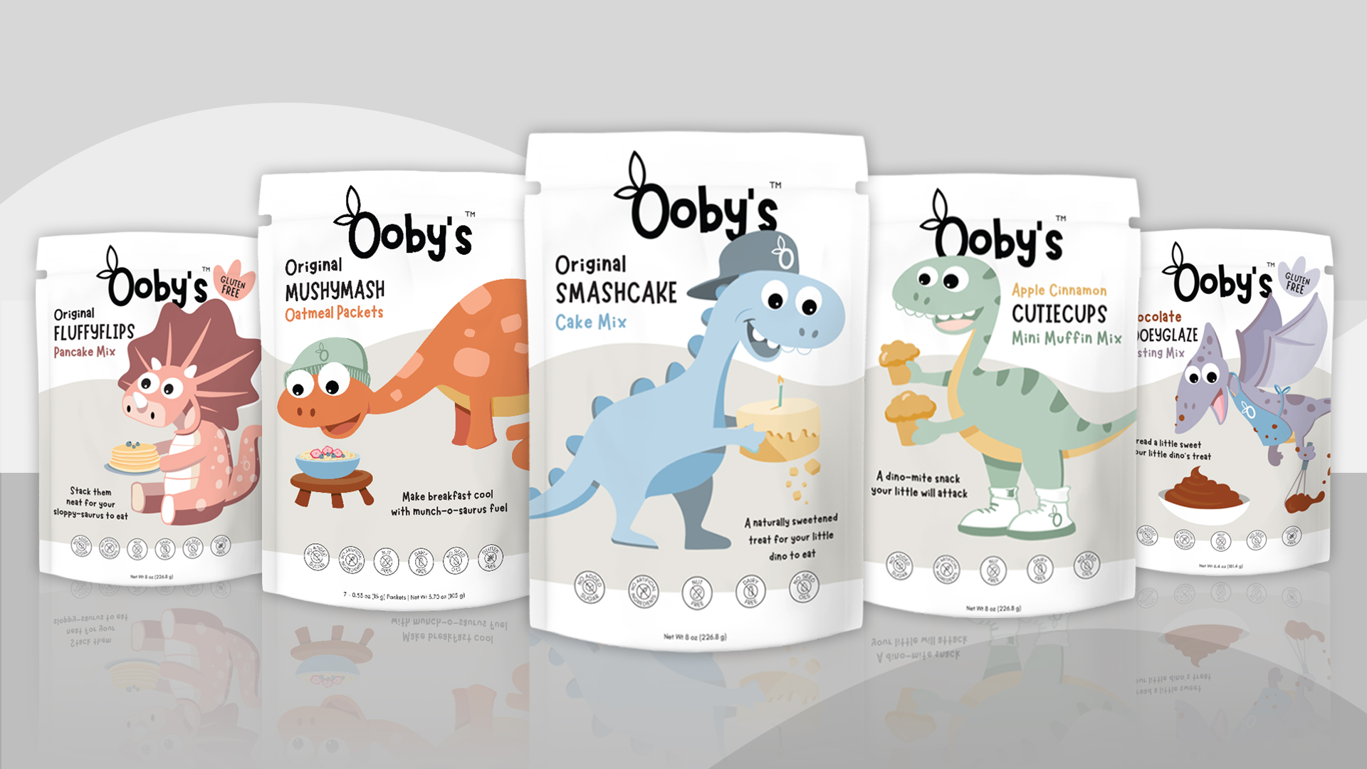
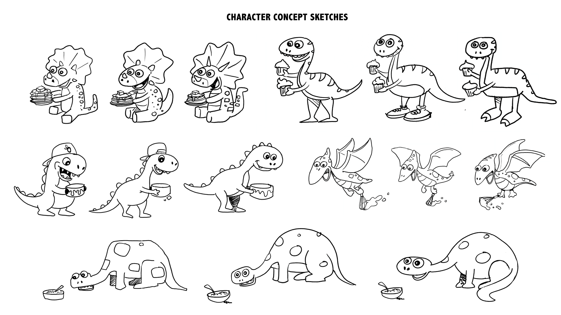
- Character Design: Created new dinosaur characters, giving them more personality and dynamic poses that resonate with modern children’s tastes.
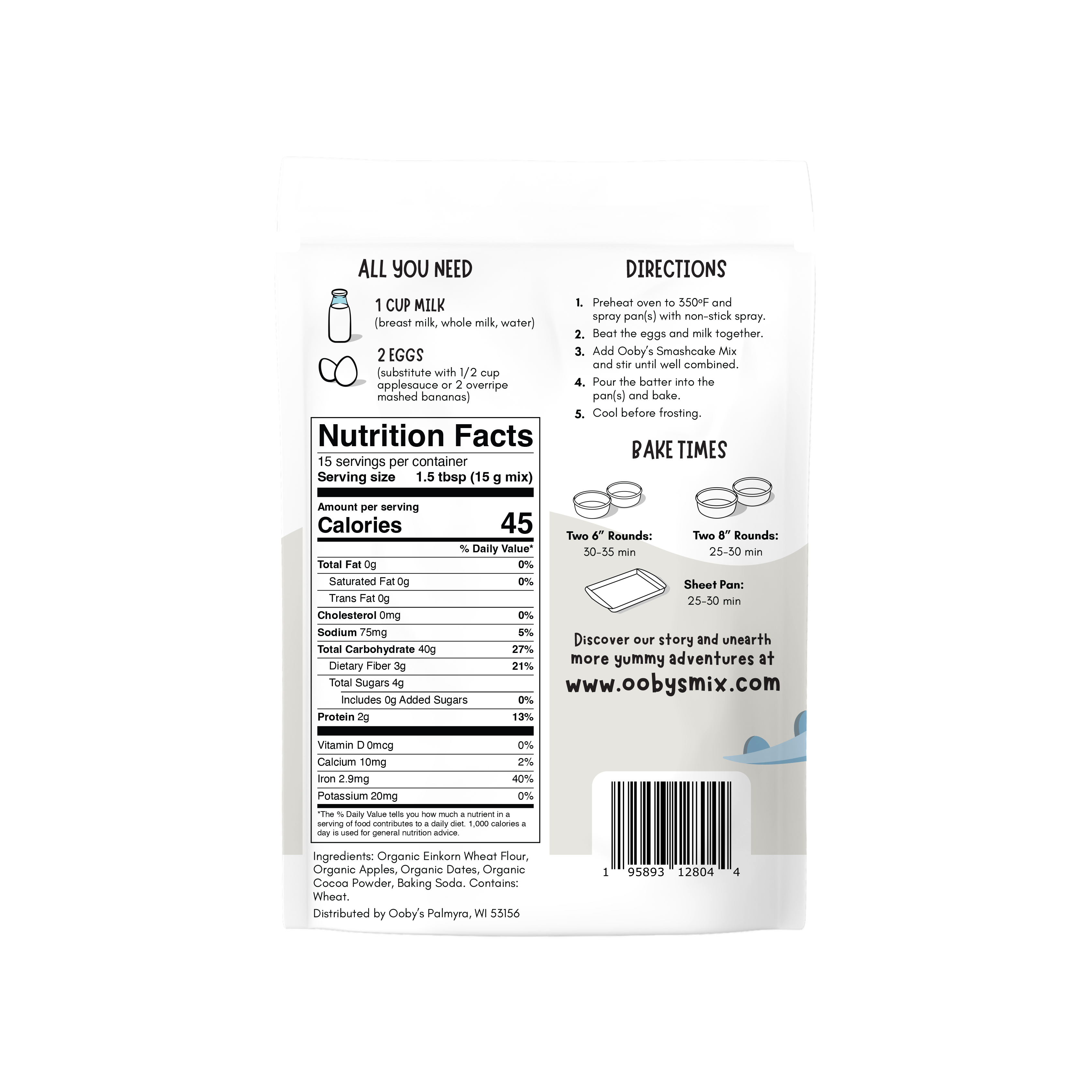
Introduced new color schemes and accessories to each dinosaur, making them even more distinctive and fun. - Packaging Layout and Design: We updated the packaging layout to prominently feature the revamped dinosaur characters, ensuring they were the focal point.
- We enhanced the background with muted colors following brand guidelines and playful wave backgrounds that grounded the characters and created a dynamic layout.
- Used bold, easy-to-read fonts, icons, and violators to highlight key product information such as “Gluten-free” in a way that’s appealing to parents.
- Added interactive elements like Dino jokes on the packaging to further engage children and enhance the client experience.
- Character Design: Created new dinosaur characters, giving them more personality and dynamic poses that resonate with modern children’s tastes.
The Results:
This redesign project demonstrated Catral Doyle Creative Co.’s ability to refresh a product’s packaging to modernize the brand.
I am absolutely thrilled with the designs Catral Doyle Creative Co. has completed for Ooby’s! From the moment we began discussing the family of dinosaurs, I fell in love with the fresh, vibrant approach.
The new dinosaur characters are bursting with personality, and the updated color schemes and playful elements perfectly capture a sense of fun. The team’s vision and creativity have truly transformed the look and feel of Ooby’s, making it exciting for children while still communicating transparency and health to parents.
Catral Doyle Creative Co. has done a phenomenal job of bringing this vision to life, and I can’t wait to see how this exciting new look impacts our brand’s presence on the shelf. Thank you for your outstanding work!
